
In New York, NY, printed communication has to work quickly. A storefront notice, appointment form, community flyer, event poster, or building directory may be read while someone is walking through a busy lobby, waiting for a train, or navigating a crowded sidewalk. Thoughtful design makes those moments easier. Businesses planning color posters New York NY, can use the same accessibility principles that improve everyday handouts, menus, brochures, signs, and forms.
Accessible print is not about making every piece look identical or plain. It is about making important information easier to notice, read, understand, and act on. Clear type, useful spacing, strong contrast, and direct language help people with different reading needs while also making communication more efficient for everyone.
Why Accessible Print Matters
Printed materials often carry time-sensitive details: an office relocation, a schedule change, an enrollment deadline, a safety instruction, or a call to register. If readers cannot quickly identify the message and next step, the material is not doing its job. Planning for accessibility from the beginning can reduce avoidable confusion and make customer-facing communication more consistent.
In a city where audiences may include residents, visitors, employees, patients, students, and customers, it also helps to consider different ways people receive information. The effective communication guidance under the ADA recognizes that large print and accessible electronic information can be appropriate aids in some situations. The right format depends on the importance, length, complexity, and context of the information.
Common Barriers in Printed Materials
Many print problems come from trying to fit too much into too little space. Dense copy, low-contrast colors, decorative typefaces, and image-heavy backgrounds can make a polished-looking piece difficult to use. Other common barriers include instructions conveyed only through color, narrow margins that feel cramped, overly long paragraphs, and forms with unclear labels or too little space to write.
A good starting point is to ask one question: can a person identify the purpose of this piece, the most important detail, and the required action within a few seconds? If not, simplify the hierarchy before adding more design elements.
Choose Readable Type and Layouts
Use a straightforward typeface with letterforms that are easy to distinguish. Keep body text at a comfortable size for the intended reader and viewing distance, and avoid compressing it to make room for extra content. Shorter line lengths, visible headings, and breathing room between sections make a page easier to scan.
Use bold type selectively to emphasize deadlines, locations, or action items. Avoid relying on underlining, long passages in italics, or blocks of all-capital letters, which can slow reading. Group related information together. For example, an event’s date, time, address, and registration method should appear in a single, predictable area rather than scattered across a flyer.
Use Color Carefully
Color can guide attention and support a brand, but it should not carry the entire meaning. If a form marks required fields in red, add the word “required” or an asterisk with an explanation. If a map uses colored routes, label each route clearly so the information remains understandable without color alone.
Strong contrast between text and its background is especially important for headlines, directions, phone numbers, and safety information. Light text over photography may look dramatic on a screen, but it becomes hard to read after printing. A printed proof is valuable because paper stock, ink coverage, lighting, and finish can change how colors appear.
Write Clear, Useful Content
Accessibility also depends on the words themselves. Lead with the main message, use familiar language, and give readers a direct next step. Replace vague wording such as “Please be advised of the following operational adjustment” with “Our office will close at 3 p.m. on Friday.”
Break complex instructions into numbered steps. Use bullets for lists of required items. Put dates, hours, addresses, and contact information where readers expect to find them. In New York, where a poster may compete with dozens of nearby messages, concise writing gives the design room to work.
Make Signs, Posters, and Banners Easy to Read
A hallway poster, sidewalk sign, trade-show banner, and meeting handout have different viewing conditions. Match the size of the message to the distance from which it will be read. A poster viewed from across a lobby needs a brief headline and large, high-contrast information. A handout can provide more detail because the reader can hold it closer.
Give each large-format piece one primary job. It may announce an opening, direct visitors, promote an event, or explain a service. Place the main message first, then the essential supporting detail, followed by one clear action. Consider glare from windows, overhead lighting, mounting height, and whether people will be moving past the sign rather than standing still.
Offer Alternate Formats
Print is useful, but it cannot meet every need on its own. For longer documents, detailed forms, public notices, or materials that change frequently, offer an alternate format when appropriate. This might include a large-print version, an accessible digital document, plain text, or a mobile-friendly webpage.
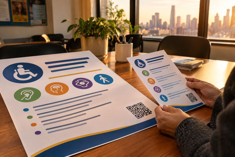
QR codes can help connect a printed piece to registration pages, updated schedules, translated content, or expanded instructions. They should support, not replace, essential information. Include a short web address or another contact option when possible, and test the code on multiple phones before distribution. New York City’s guidance on creating accessible content also reinforces the value of clear text alternatives and accessible digital information.
Review Materials Before Printing
- Print a proof at the final size and read it in typical lighting.
- Check whether the headline, deadline, and call to action stand out immediately.
- Confirm that phone numbers, addresses, QR codes, and web details are accurate.
- Review margins, alignment, spacing, and contrast.
- Try viewing the piece from its intended distance.
- Ask someone unfamiliar with the project to find the main information.
A Simple Accessibility Checklist
- Is the central message easy to identify?
- Is the text comfortable to read at the intended distance?
- Does the text stand out clearly from the background?
- Do headings and spacing make the content easy to scan?
- Are color, icons, and labels used together when meaning matters?
- Are instructions short, direct, and complete?
- Are alternate formats available when the audience or content calls for them?
Common Questions About Accessible Print
Does accessible design make materials less creative?
No. Strong hierarchy, well-chosen images, intentional color, and ample white space can create a distinctive design while keeping the message clear. Accessibility gives design a practical purpose: helping more people use the information.
Should every printed piece have a QR code?
No. Add one only when it provides a useful destination, such as current event details or an online form. A QR code should not be the only way to obtain critical instructions.
When is a large-print version useful?
Large-print copies can be helpful when a document is lengthy, customer-facing, or likely to be used by people who benefit from larger text. Consider the setting, audience, and importance of the information before production.
Final Thoughts
Accessible print begins with practical decisions: readable type, strong contrast, plain language, logical structure, and a real-world proofing process. For New York organizations, these choices help keep materials useful amid busy streets, shared workspaces, public venues, and fast-paced daily routines. When print is planned with clarity in mind, it becomes easier for more people to find the information they need and act on it with confidence.